Maloka Dinámica was the proposal for the open contest for the new visual identity of the Maloka Interactive Center, in Bogotá, Colombia.
Maloka is a non-profit organization dedicated to promote science and technology through educational experiences, aiming to enrich the cultural appropriation of knowledge for Bogotans and Colombians in general. This activity takes place in the interactive center, located at the heart of the city and therefore, a well known landmark of the city.
Photo by: Viceministerio de Turismo de Colombia
Maloka takes its name from the malocas, the main traditional gathering place of the native tribes in south america. An architecture that represents the social heart of the tribe, as well as the sacred space where the earthly and the divine come together.
As a Museum Maloka has a very particular architecture: on the surface there is a spacious open area, with mainly two big structures, a dome and a glass prism, from which the public has access to the exhibition area, which is below ground level. In this area, the visitor can interact with all kinds of machines and play several illustrative games centered on mechanical principles, perceptory illusions and other scientific experiments. The dome works as an immersive movie theater and is usually a standalone attraction.
Our proposal comes from an abstraction of the most representative elements of the museum. For once, the architecture is very well placed in the collective memory of millions of bogotans, therefore representing such elements would be key. On the more conceptual side, above and below is a very present contrast, bringing sky and earth together in one.
We also studied the concept of the Möbius Strip and the infinity symbol, as a strong concept of continuity would be completely in line with our proposal.
Last but not least, we yuxtaposed some elemnts of the logo in order to represent the pillars of the organization
One Color version
Multiple colors version (one possible variant)
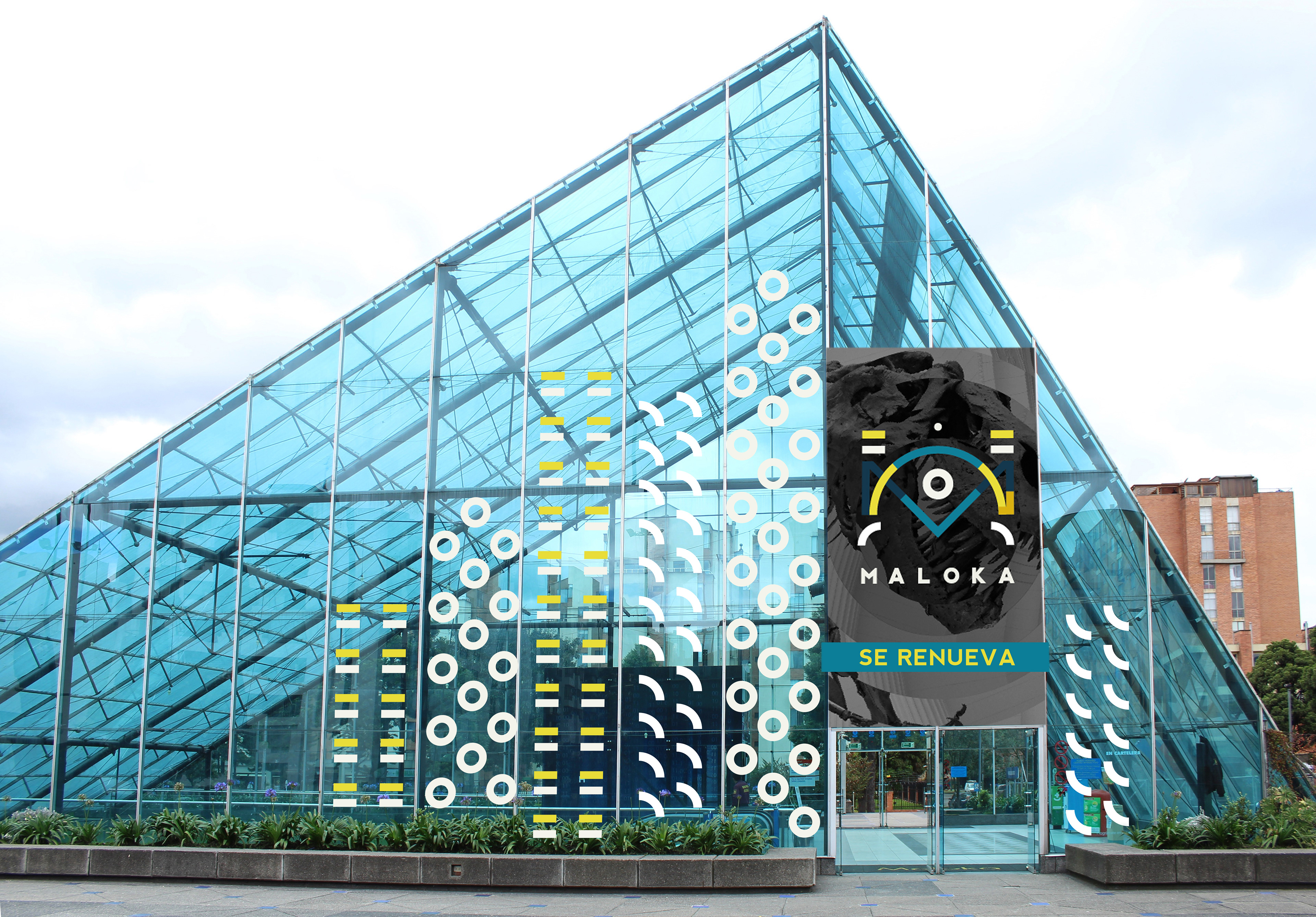
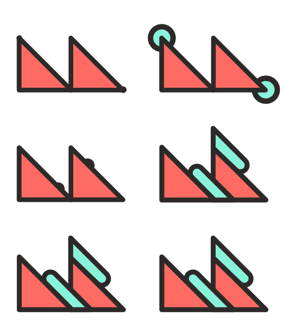
Exploration of possible variants with ornaments. The logo finally becomes a dynamic identity.
It was very important for us to give the brand the freedom to plan its own evolution through a dynamic identity. For that reason we proposed this visual exploration just as to show the endless versatility that the logo would have had.
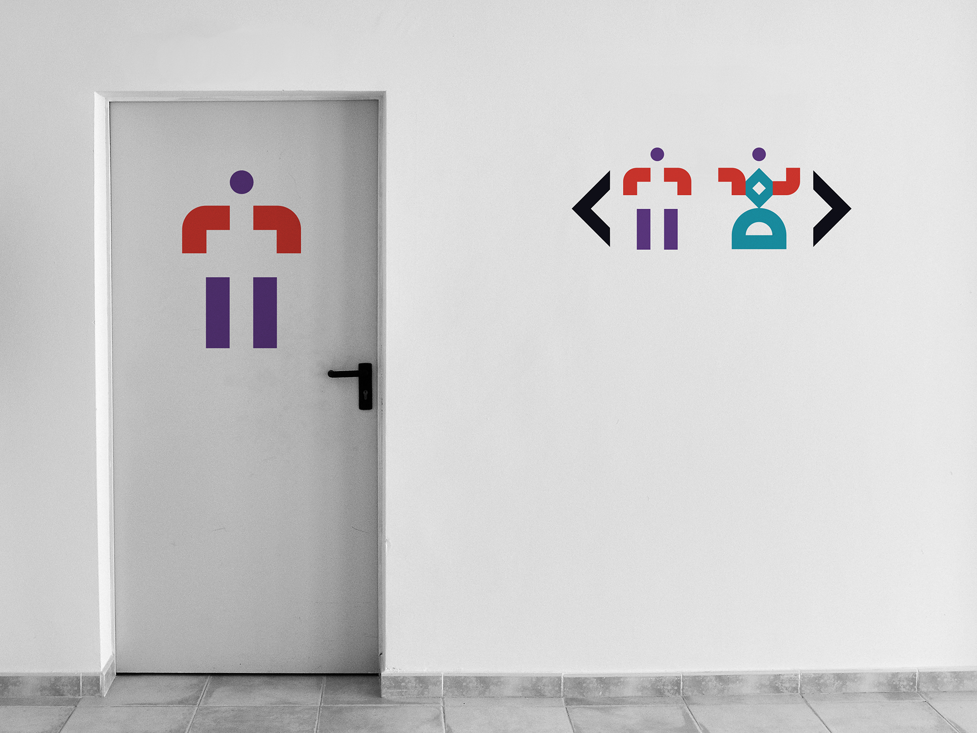
Graphic Lirabry and some possible assets.
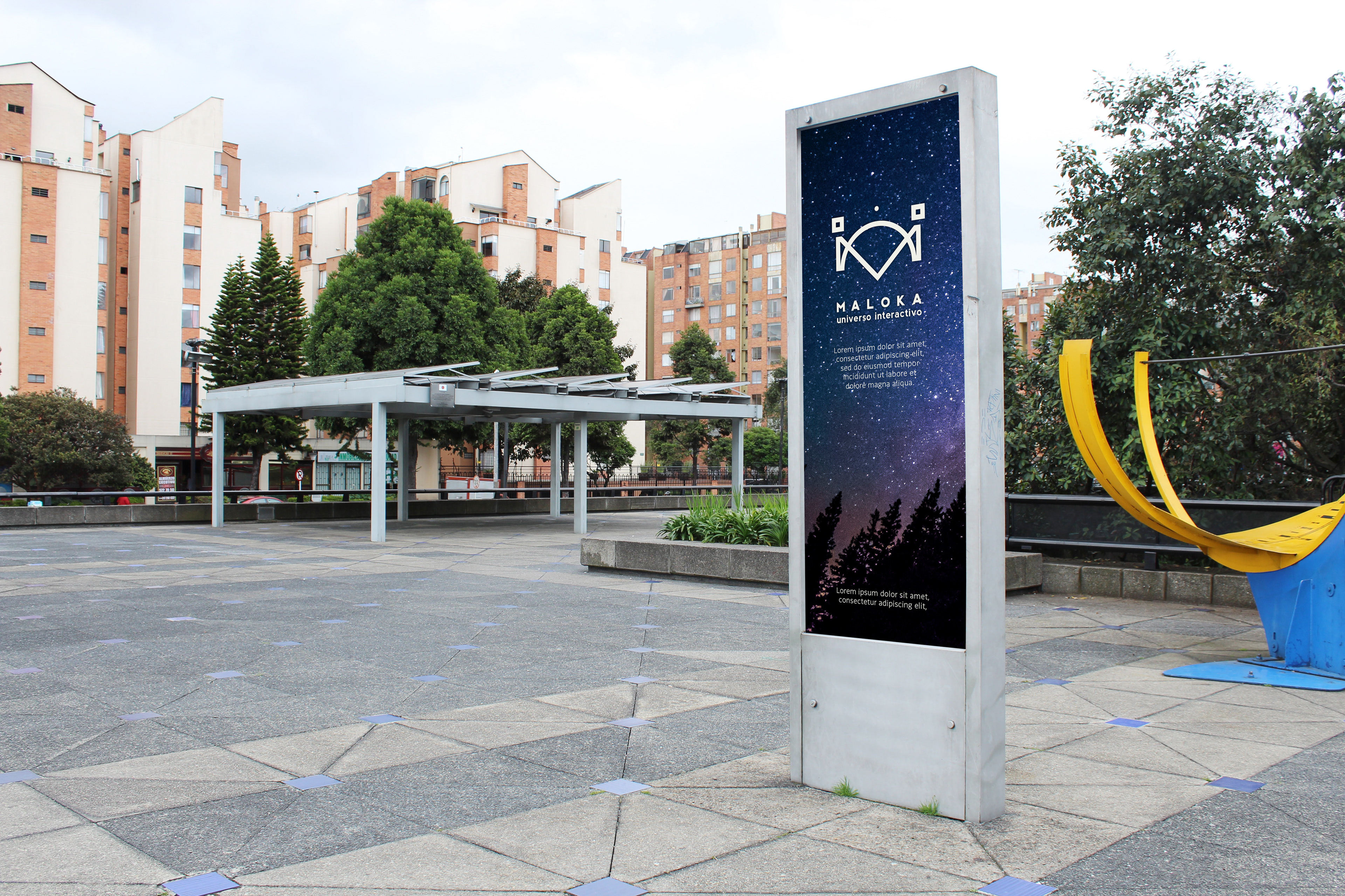
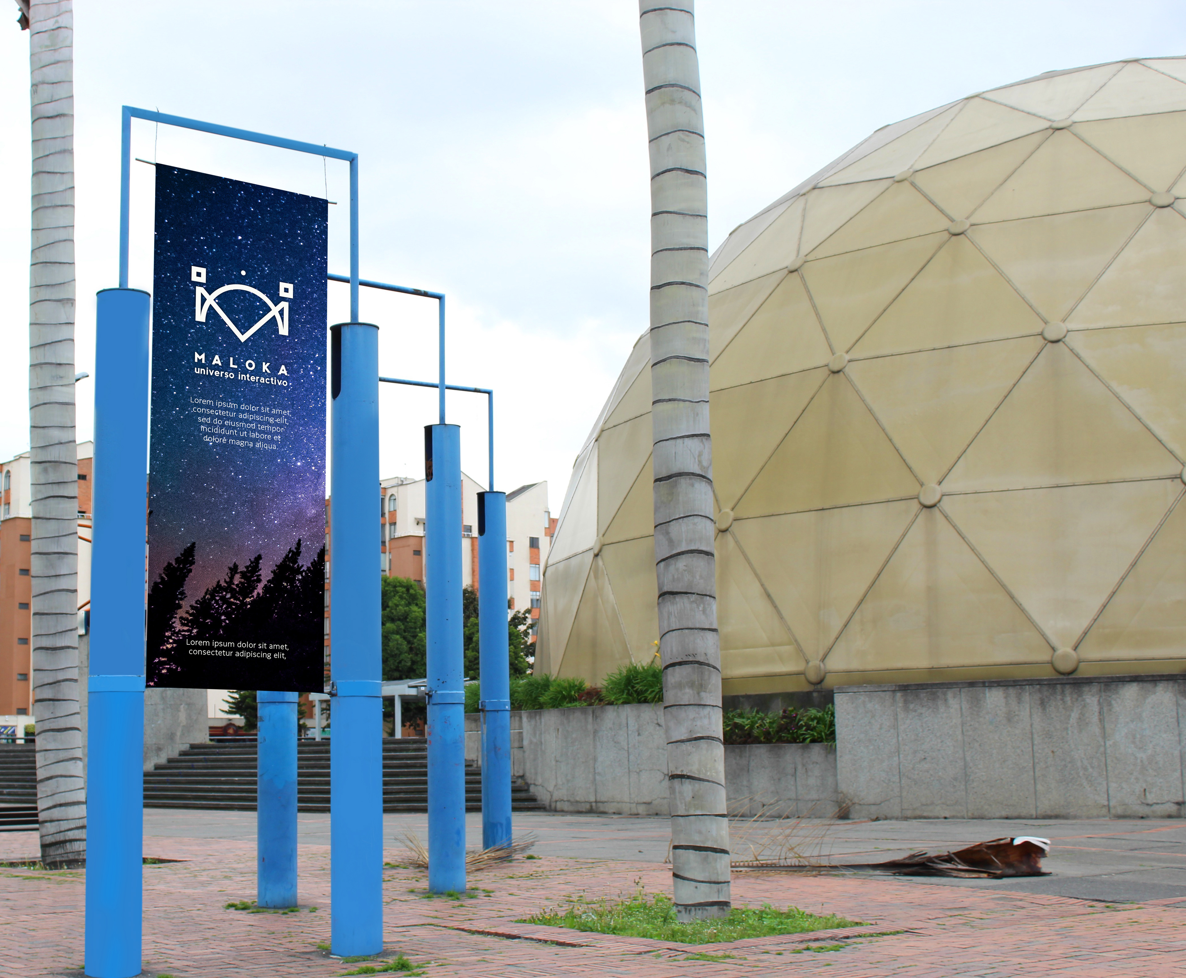
Applications
